ModalChoice.com
Data Mapping creates visual representations of transit and paratransit service characteristics.
Paratransit operations in existence today have grown up merely responding to random requests for service from people who signed up for it, rather than by directing customers to the best options that are available to them. Mostly, passengers do not reason out that if they use a bus, they could get where they need to go without the need for making a reservation one or more days in advance. Buses followed streets and routes that were planned around traffic conditions and population densities. Paratransit was supposed to be an alternative for people who could not get on the bus because there was no lift, or the sidewalks were not ramped to the street or were non-existent. However, today many types of eligible paratransit riders use the vans services and never considered, tried or used a fixed-route bus or train.
Across the country, tens of thousands of persons with disabilities have become accustomed to "calling for the van" without ever considering that a bus could get them to their destination. Overloaded transit systems, put themselves in jeopardy by denying services to customers who they themselves determined as being in need of paratransit services. Denying an eligible passenger his/her requested paratransit trip may be a violation of his/her Civil Rights.
Read through the following checklist of questions and ask yourself what the answers are:
- Do you know where your trip denials are? Are they concentrated in one or more specific geographic area, time period or day of week? Do they constitute a pattern of practice?
- Are many of your ADA paratransit trips actually picked up or dropped off outside the ¾ mile ADA service area?
- Could some of your eligible riders actually take the bus for some or all their travel needs?
- Could some of your paratransit obligations be handled by a modified routing of a fixed-route bus? Could you better serve an area by putting a bus route where the paratransit demand is high?
- Do you know which neighborhoods have high densities of eligible riders?
- Where are your paratransit and transit trip generators located?
- Do many of your customers pass up alternative places of equal or greater desirability to go to more distant places because they do not know where theses better places are?
- Can you improve fixed-route accessibility in one or more areas and reduce the demand on the paratransit system?
Knowing the answers to these questions and seeing the data graphically represented can help the decision-making process. The following maps serve that purpose.
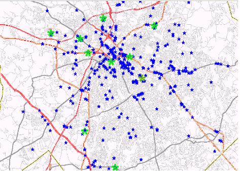 |
These maps show sample data for illustrative purposes. Above, the blue stars represent the locations where passengers go and the green blobs are Dialysis units. Note that most of the destinations are the main streets. At the below are a mappings of all Doctor offices addresses and the location of Restaurants whether served by paratransit trips or not. Your trip data can be used to create these and many other illustrations to assist with policy making and service planning. |
| Notice how the Doctor offices are clustered in several specific areas. What is more important is that there are many neighborhoods where the residents have to travel great distances to see a Doctor. | 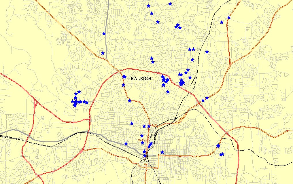 |
| This map shows all the listed restaurants in the Raliegh area. The vast majority of them are located along the arterial highways. A public transit fixed-route bus user is unlikely to travel to the NE quadrant to eat a meal when there are dozens of right near by. This is especially true when the bus trip takes 1.5 to 2 hours one-way. | 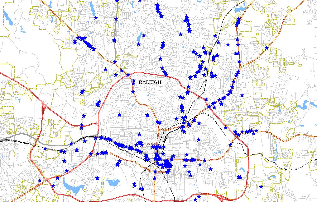 |
Many transit systems and paratransit systems already use a computerized data handling application. ModalChoice can use your own data files (dBASE, Excel, Access, Text, etc.) to create maps depicting your service area. This can be accomplished at a much lower cost to you that by hiring a transit planner on an annual salary and outfitting him/her with all of the computer hardware, software and databases necessary to do the same thing. And it will not consume the valuable time of your present staff, who are already too busy, to consider adding GIS and mapping duties to their job descriptions.
The 2000 Census identified how the population demographics changed since 1990. We can show you the neighborhoods where you are most likely to have populations such as "persons 60 and older", where "Group Homes for persons with disabilities" are, and locations where there are high concentrations of children of any age bracket 1-5, 6-10, 11-15 years, etc.
Maps depicting your data by Zipcode, census area, service areas, jurisdiction can be made.
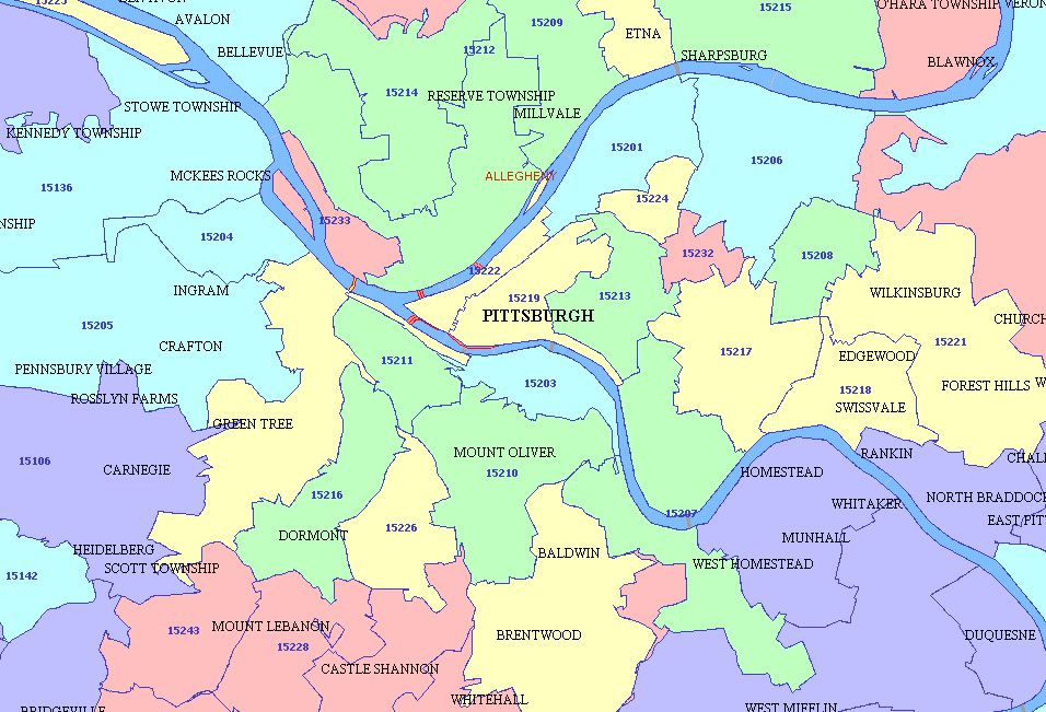 |
Population figures from the 1990 and 2000 Census files can be overlaid as layers on each colored area to show the demographics of that area. Census tract level data can also be shown. |
|
|
The analysis that has been applied to the Dialysis trips can also be applied to any trip purpose, any day of the week, any time period of the service day. Mapping of trips makes the evaluation of service coordination easier to understand and present for decision making purposes. Several service providers' data can be combined and color coded to show who is doing what service and where. |
 |
Let ModalChoice help with your transit planning or BE your planner. ModalChoice has 37 years of operations and planning experience. Short term tasks are a specialty. Call 202-271-8499 or write to Robert@ModalChoice.com